Multiple Aspect Ratios and Resolutions with SpriteKit
Let's take a look at a solution for SpriteKit when handling multiple resolutions and aspect ratios for a pixel based game which has to work consistently on any screen size.
Building a pixel based game that supports multiple resolutions and aspect ratios which also has to work consistently on any screen from a small iPhone to a 4K Apple TV is quite a challenge. Especially when factoring in that the gameplay experience must remain equal and fair where no device gets an advantage because of a more favorable screen size while also ensuring that the game looks great on any screen.
I've just faced this challenge for the shoot 'em up game I'm developing in Swift using the SpriteKit framework. Let's take a look at the problem and the solutions I've come up with.
The Problem
As it is a shmup with predetermined enemy behavior the gameplay must remain the same where the enemy waves always enter the screen at the same time and at the same position no matter what device the player is using, which can range in aspect ratios from 4:3 (iPad) to 19.5:9 (iPhone 11). That's quite a span.
Apart from appearing at the same position and at the exact same time on each play-through also consider things like velocity, position, size, path node coordinates and so on that must remain identical between different resolutions. Scaling and compensating all game coordinates and entity behavior attributes could be a potential nightmare to handle if not abstracting between the actual device resolution and the game world.
The Options
One simple solution would be to make the game in a predetermined size and scale it to use as much as it can on the device screen and have black bars around the game on devices where it does not fit. As letterbox is not popular with Apple I suppose using the dead space for optional GUI elements instead of just black bars could be a potential solution in some cases. But not great.
If actually wanting to always take full advantage of the device screen and have no real dead areas no matter what aspect ratio, it gets a bit more tricky. For this game I want the actual gameplay area to fill the entire screen on each device that can run the game, while still remaining true to the initial requirement of a consistent gameplay experience. No form of basic letterbox is acceptable.
The next option would be to design the game for the widest possible screen and then let the camera pan as the player moves the craft on devices which can not fit the entire play area on screen. When the player moves towards a screen edge the camera would pan along to reveal more. That would not be that bad and we've got rid of the letterbox. In the case of a shmup and a device with a narrow screen this solution would potentially make the player miss spotting enemies if not keep patrolling left and right. That's the deal breaker as that does fulfill the requirement to keep the gameplay consistent between devices. For other game types this might be a good way to go.
The third option, the one I decided to go with, is to decide on a base size, in points, for the game. I'll refer to this size as the game's logical size. The game is scaled so the logical size always fits on the device screen, this is the area where all gameplay takes place and provides consistent values to use for all movement and time calculations. The background artwork will need to have additional margins, that will be displayed on devices that have additional space outside the logical game size, so the background keeps filling the screen and will look beautiful on every device. No important action will happen out in the margin areas to keep the main gameplay experience consistent between devices.
A conclusion I made is that it is practically impossible to make the experience completely identical between different devices without using letterbox for a game of this type. The third option get us close though, close enough to an acceptable level of maintaining consistency while also still looking great on each device. The best option in many cases for these kind of games.
Let's examine the actual implementation in more detail...
Logical Size
I decided to use a logical size of 960x540 points which gives me a 16:9 aspect ratio. I found that to be a comfortable size that are somewhere in the middle, not too far off from any screen of the devices the game will support.
To keep this aspect ratio and still fill the screen of any device I am creating the background artwork to have large enough margins to be able to expand outside the logical size and fill the entire screen on any device.
For iPhones up to the iPhone 8 series, 16:9 is already a perfect fit. Naturally the same goes for Apple TV, which is the device I personally enjoy the most as a gaming device and tvOS will probably where I first release the game.
iPhone X and other newer phones are wider than 16:9, so that's a case where additional margin on the background artwork is required.
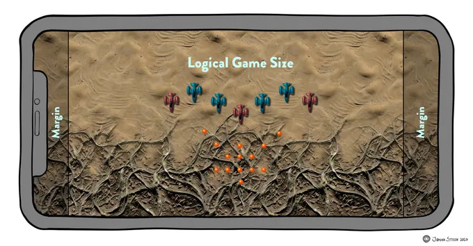
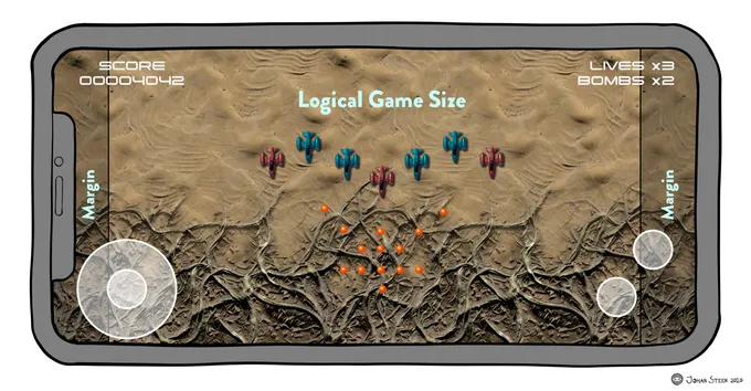
This additional space will partly just be visual candy to make the background fill the entire screen. There will be no important action happening out in the margins, to guarantee that the actual gameplay remains the same between devices.
The HUD on the other hand will take advantage of the additional size, which makes this solution differ quite a bit compared to just using some sort of letterbox. The HUD will use the full size of the device and move controls like the thumbstick, fire buttons and other labels out of the way from the game play area when a device screen allows for it.
Then we have the other side of the spectrum, the iPad, which is narrower than 16:9. Most iPads are at a 4:3 aspect ratio with some exceptions like the 11" Pro which is slightly wider.
The iPad was the reason I at one time considered going with a 4:3 logical size for the game so I only had to deal with adjusting the width. That size did generate way too much "dead" space on wider devices and was too much of a compromise. Eventually I ended up at a 16:9 middle ground which I'm happy with now.
For the iPad I use the margins to add additional height to squeeze down the logical gameplay area to fit within a 16:9 section of the iPad's screen. Initially I planned to grow it from the center and have top and bottom margins on the iPad.
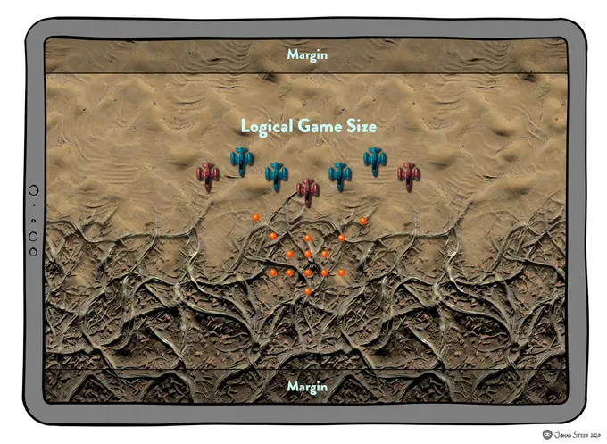
By adding a margin on the top, the iPad gets an increased line of sight compared to other devices. That would give the player an advantage on the iPad by seeing the enemies earlier as most of them will come from the top. (I might have a few enemies coming from the side where the iPhone will see them earlier but that will be a more negligible advantage).
To solve that I decided to place the entire margin on the bottom of the screen instead to ensure that playing on the iPad doesn't let you spot the enemies earlier to keep the gameplay equal and fair between devices. Getting some extra room at the bottom should add minimal extra advantage.
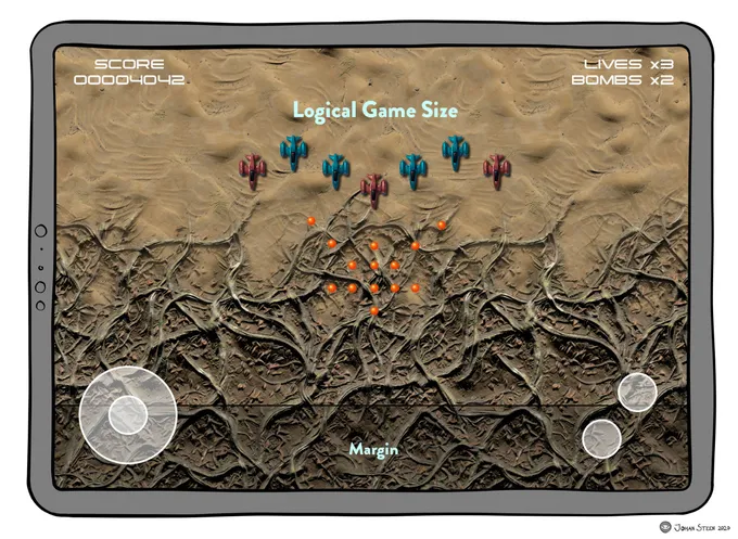
The extra height on the iPad is also used to move the touch controls partly out of the way from the active play area so the thumbstick and fire buttons is located in the margins when possible.
Implementation
The implementation is not very complex. I keep an enum with game configuration constants where I placed the definition for the logical size of the game which I can refer to whenever I need to do any calculation based on the size.
enum GameConfiguration {
    enum Core {
        static let gameWidth: CGFloat = 960
        static let gameHeight: CGFloat = 540
    }
}
When a scene is presented I get the actual device size from view.frame.size and use that together with logical size to calculate the factor needed to divide the device size with to get a size for the scene that will fit the logical size perfectly in the view and add the margin in the correct direction when required to use a margin.
class GameManager {
    func presentScene() {
        var factor = view.frame.size.height / GameConfiguration.Core.gameHeight

        if view.frame.size.width / factor < GameConfiguration.Core.gameWidth {
            factor = view.frame.size.width / GameConfiguration.Core.gameWidth
        }

        let sceneSize = CGSize(width: view.frame.size.width / factor,
                               height: view.frame.size.height / factor)
        let scene = LevelScene(size: sceneSize)
        scene.scaleMode = .aspectFit

        view.presentScene(scene)
    }
}
Safe Areas
During level design and defining the enemy movements and their spawn and trigger positions I'm working with a 16:9 safe area where the important gameplay happens.
In the latest version of my Level Editor I've added safe area overlays for different devices so I see that triggers and positions are within an area that will look great on any device and at the same time also lets me see that the background artwork fills out the screen properly.
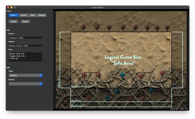
This also lets me verify that the enemies doesn't abruptly enters or exits on devices with other ratios than 16:9. I can add necessary adjustments during positioning of entities in levels to ensure that the level design will work great on any supported screen size.
Asset Resolutions
As the game is scaled from a logical size I've to take that into account when creating assets and design them at a resolution where they will remain crisp after the game scene has scaled from it's logical size to the actual resolution it will be displayed in.
While I work in a predetermined size of 960x540 points and might define the player's craft at a size of 54 points, the actual pixel resolution will vary considerably for different devices. An asset of 54 points will need to be in a pixel resolution of 216 pixels on a 4K Apple TV to remain perfectly sharp and crisp. The same 54 point asset would only require 75 pixels on an iPhone 8 to be perfectly crisp.
To help me quickly calculate pixel sizes for assets I'm using an old trusty spreadsheet. I often forget how handy a spreadsheet can be when it comes to track different things during development. I created this document with Numbers where I can change the asset size in points and quickly see the perfect pixel size for each relevant device.
The highest resolution required is for the Apple TV4k, with the iPad Pro 12.9" not far behind. Every asset for the game will be made to hold up for the 4K resolution and then I'm using a command-line gulp script that scales them down to perfect sizes for other devices. The script also handle the background artwork where it both crop tiles and resizes the tiles for different devices. The script updates the asset catalog directly in Xcode when run.
Once I've fine tuned the Asset Catalog Generator script more I'll probably open source it and put it on GitHub.
